You have no items in your cart. Want to get some nice things?
Go shopping
You might not think it, but there’s more to a successful colour scheme than meets the eye. It’s something far more subconscious.
Colour psychology is the study of how colours affect our decisions through the emotions they evoke. We can perceive the same colour differently, or multiple shades of the same colour. This is the first level of colour psychology – the psychological properties of the eleven basic colours which can be either positive or negative. According to pioneering colour psychologist Angela Wright, it’s actually the combination of colours that evokes a positive or negative emotional response. This forms the second level of colour psychology.
When designing a home, reflecting on colour psychology can allow us to choose colours which suit our colour personalities (more on that below) or own personal preferences for colour, rather than just copying what we see on Pinterest or in magazines. It’s this individualised approach – the idea of creating a home we feel in harmony with – that we want to explore.
The Meaning of Colour
Have you ever thought about why we view certain shades, tints and tones of each colour differently? For example, why might you be drawn to a lemon yellow, but can’t stand a mustard yellow? There are a few factors at play here:
- Colour psychology
- Colour in culture
- Personal colour associations
What can often be described as colour psychology is actually colour symbolism – the conscious cultural connections and personal associations we have with colours. Purple, for example, was once linked to royalty and luxury as it was a very expensive dye to buy. We can also make personal associations with colours due to pleasant or unpleasant memories and experiences. Sometimes these personal associations or cultural connections can coincide with the properties of colours in colour psychology, but Wright maintains that they are separate fields.
Supporting and building on Wright’s work is Karen Haller, a brand and interiors consultant with 20 years experience in Applied Colour Psychology. Differing from colour symbolism created in culture and by personal associations, colour psychology, “resides at the unconscious level and influences how we feel, behave and interact with others. It can affect our mental, physical and emotional health and wellbeing”, Haller writes in her e-book.
Properties of Colours
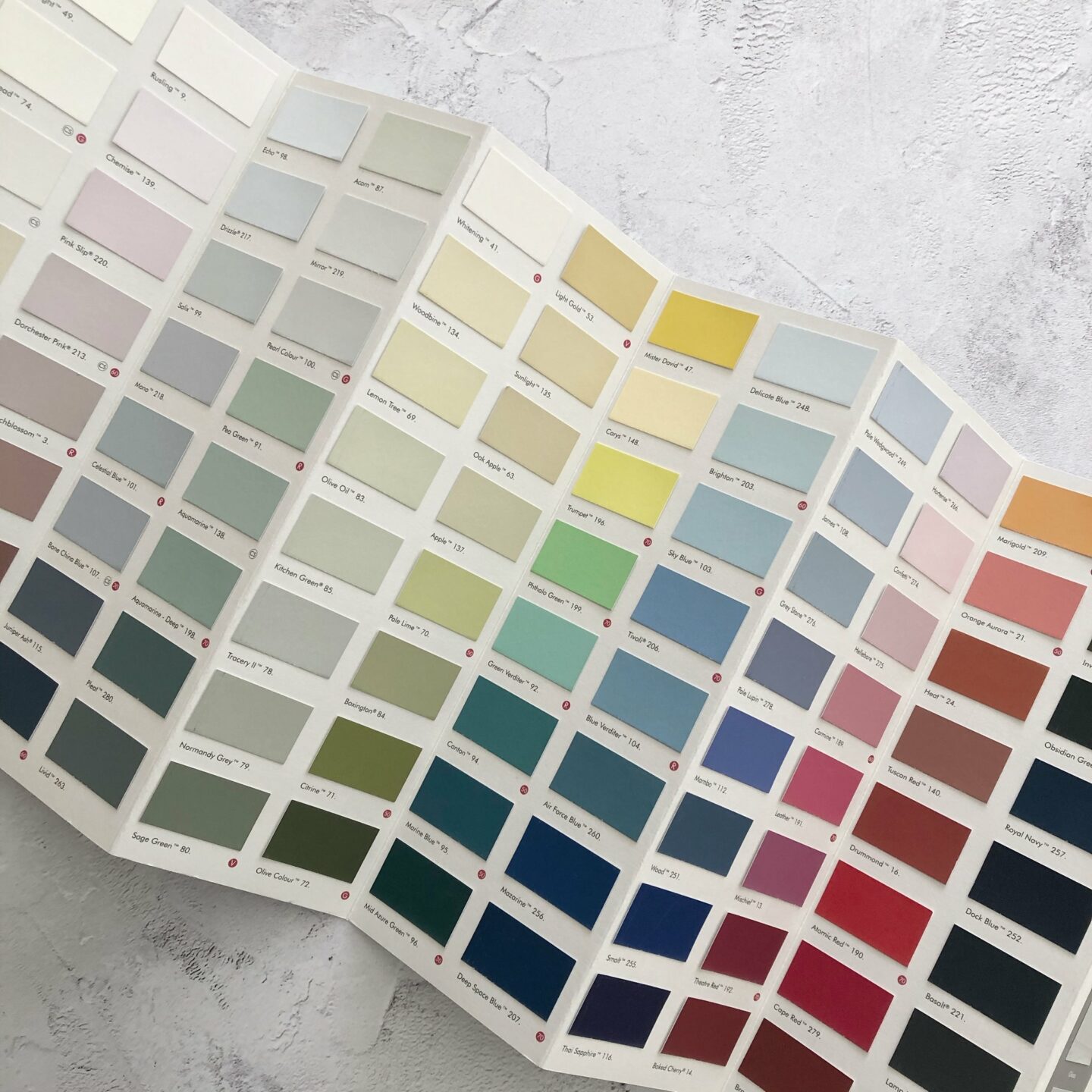
Below, you’ll find the positive and negative properties of the eleven basic colours.
Red
Positive: physical strength, courage, energy / Negative: defiance, aggression, impatience
Blue
Positive: calm, serenity, intelligence, trust / Negative: coldness, unfriendliness
Yellow
Positive: optimism, self-confidence, creativity, happiness / Negative: emotional fragility, anxiousness, can seem overstimulating
Green
Positive: harmony, rest, balance, growth / Negative: boredom, stagnation
Purple
Positive: luxury, authenticity, quality, spirituality / Negative: decadence, inferiority
Orange
Positive: warmth, fun, security / Negative: frustration, immaturity
Pink
Positive: warmth, nurturing, love / Negative: inhibition, physical weakness
Grey
Positive: neutrality, balance / Negative: lack of energy, hibernation
Black
Positive: sophistication, safety / Negative: heaviness, sorrowful
White
Positive: purity, cleanliness, simplicity, efficiency / Negative: coldness
Brown
Positive: reliability, earthiness, support / Negative: heaviness, lack of sophistication
Read more about the meaning of colours and branding examples.
Despite positive and negative traits of each colour, Wright doesn’t believe a colour is inherently good or bad. ‘There’s no such thing as a good colour or a bad colour. Every colour has the potential for a positive reaction. It’s a question of colour combination,’ Wright explains, speaking to Design Week. A useful example is when black and yellow are combined. Individually, they may represent optimism or positiveness and safety or sophistication respectively, but when paired together they symbolise danger (think bumble bees and hazard signs).
The Wright Theory and Colour Affects System
In the late 1970s and early 1980s, Angela Wright developed her theory that there are links between patterns of colour and patterns of human behaviour. In the early 1990s, it was proved that the colours which Wright had grouped together had mathematical connections between them that did not apply to colours of different groups. Wright thus developed the Colour Affects System:
- There are four colour families or groups – each colour naturally harmonises with other colours in the family or group. Colours from different groups don’t go together.
- There are four personality types.
- Each personality type is naturally drawn to one colour group.
- Each colour group has a personality type.
Each colour group can be assigned a season (spring, summer, autumn, winter) which neatly represents the personality traits of the colour family. So when we experience a jarring colour scheme, colour psychology would deem it due to the combining of colours from different colour groups. Haller explains, “the key to a positive harmonious colour palette is the relationship between combinations of colour.” This approach takes colour harmony (usually just based on the traditional colour wheel) to a deeper understanding.
The 4 Tonal Groups of the Colour Affects System
Spring/Playful
- colour palette: clean, clear and fresh – colours contain yellow
- personality: outgoing, energetic, but can find it difficult to focus on one thing and experiences a need to be liked
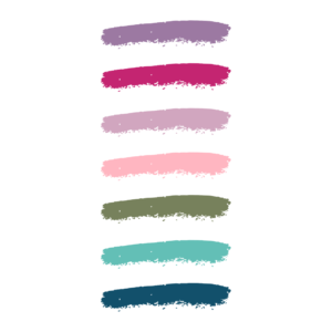
Summer/Serene
- colour palette: cool, subtle and delicate – colours contain blue and grey
- personality: calm, graceful, a quiet observer, sometimes taken for shy or cold
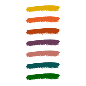
Autumn/Earthy
- colour palette: fiery, rich and earthy – colours contain warm yellow and black
- personality: warm, caring and happiest in nature, but can sometimes seen bossy or dominating
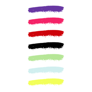
Winter/Minimalist
- colour palette: cold, either very light or very dark – colours contain blue (the only palette to include pure black and white)
- personality: self-assured, confident, clear and concise, yet sometimes unfriendly or unsentimental
Inspired by Karen Haller’s A Little Book of Colour: How to Use Psychology to Transform your Life
Brand and interiors clients consult Haller to help ascertain which of the above colour palettes most suit their personality. In her book, she designed a quiz for readers to find their primary personality types. She also helps people understand why they may have a dislike for a certain colour due to a personal association or experience and helps them remove this blocker.
Most of us also have a secondary personality type that influences us. Haller explains that her clients’ primary personality type is usually their true self, while their second is what we think we should be. Our colour palette comes from our primary personality type, while our design style is a mixture of both our primary and secondary types.
Decorating with Applied Colour Pscyhology
The research of colour psychology reveals some key points for those looking to create harmonious colour schemes and comfortable rooms:
- Think about the context of the room – what is it being used for? Colour psychology suggests using certain colours in certain contexts can bring out the more negative properties of that colour. For example, using orange in an office space may be come across as playful and fun, and therefore distracting
- Integrate your secondary personality when choosing finishes, textiles and materials, but avoid mixing palettes
- Consider the mood you want to create for the room and think about what that looks like for you
- Don’t forget about the negative qualities of each colour which can be felt when too much is used
- Consider family members’ colour personalities too
Applied Colour Psychology offers a framework for choosing colours that helps us tap into our own personalities and needs, rather than just following trends. The aim is to feel at ease in our homes and see them as an extension of ourselves, not a reflection of someone else’s style. While finding (and welcoming) your true colour personality might take some time, it feels worth exploring if trying to create a home that’s authentically you.
More inspiration on interiors: what a slow living interior aesthetic really means, the principles of slow design, tips for a calm interior scheme and embracing slow interiors to curate a more considered home. You may also enjoy our curated list of interior design coffee table books for slow decor.
